UI I Like - Docs Search
some nice aspects of a search panel
2025-12-10
Written by: joe
I have a folder in my notes where I keep screenshots of and comments on UI that I like or dislike. This post is based on one that I liked.
Kuzu was an open-source graph database. Their docs site had a search function with a keyboard shortcut that opened a panel over the current page.

Their site looks like it was built using Astro, specifically their docs generator Starlight. You can tell from classnames like astro-v37mnknz or the meta tags in the head:
<meta name="generator" content="Astro v5.5.6" />
<meta name="generator" content="Starlight v0.32.5" />
I’m not sure whether this is just Starlight’s default theme/functionality or if Kuzu added it, but I digress.
What I like about it
Visual design
edge highlights
drop shadows
background blurs
background haze
Components
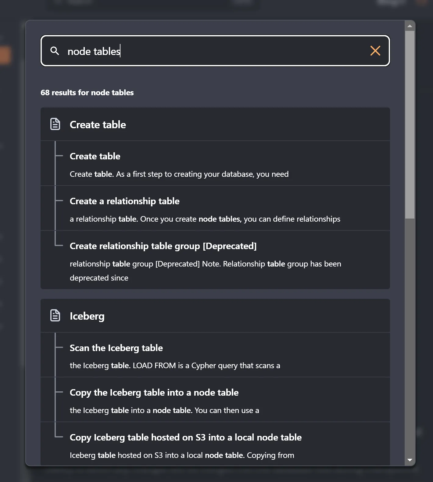
- The input, when focused, has a high contrast and obvious border around it
- There are only three icons.
- Matches within a single page are clearly grouped together, under the page title with a line connecting them.
Shortcut
The keyboard shortcut is Ctrl + K. Many sites use / for search which overrides/conflicts with a default keyboard shortcut in Firefox, where / is “Find in Page”.
This feels (and looks) analogous to ‘command palette’ interactions in VSCode where Ctrl + <Letter> can open files, run tasks, find symbols, open/close panels, etc